
Workforce Housing Model
What does it do?
Across the country, one of the main reasons commuter trip lengths are increasing and traffic conditions are deteriorating is because people do not live near their jobs. This app is used to identify areas with an imbalance between housing and jobs, and between household income and worker wage. It also shows the impact of this spatial jobs-housing imbalance on trip generation. A precursor to job-worker balance is wage-income balance. Wage-income balance indicates that the yearly salary of residents is similar to the wages paid by jobs in the area.
The workforce housing app is based on research conducted by Philip Stoker and Reid Ewing at the Unviersity of Utah, that synthesizes research from across the U.S. on the causes, measurements, and benefits of a job-worker and income balance. Stoker and Ewing use journey-to-work data from the
Census Transportation Planning Products (CTPP)
database for metropolitan census tracts across the U.S. to derive models that estimate internal capture of trips within clusters. Internal capture refers to the number of people who live and work in the same area. The workforce housing app operationalizes this research in a simple GIS-based tool that allows users to find local jobs-housing and wage-income ratios within a user-defined commute shed.
How does it work?
The app uses census tract data, including number of households, workers, household income and worker income. The app generates summaries for each tract that include the balance within a user-defined “neighborhood.” Data is aggregated for that tract and the portions of other tracts within the buffer. Jobs-worker balance and income balance are then calculated. The scenario process can be used to achieve higher levels of household to worker balance, and household income to worker wage balance.
Job-worker balance calculation:
(Resident Workers- Workers) / (Resident Workers + Workers)
Wage-Income balance calculation:
(Average Income of Residents- Average Income of Workers)/ (Average Income of Residents+ Average Income of Workers)
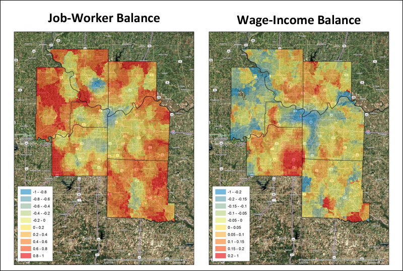
The orange-red end of the spectrum favors resident workers while the blue end of the spectrum indicates and imbalance skewed toward workers. Green-yellow indicates that there is a relative balance of jobs-to-workers or income-to-wage within the user-defined commute shed of each tract.